Judges Choice Winners

Congratulations
to our winning artists!
Meet our show judge: Marcia Pensa

Marcia Pensa has worked in a variety of different media throughout her career as an artist and instructor. As a high school Visual Art teacher for 35 years in the Thames Valley Board as well as other boards, her teaching style has focused on encouraging young artists to enjoy the process of art while gaining skills in many mediums. Art history holds a particular passion for Marcia.
Assessing and evaluation has been an important component of the school system at the high school level. Marcia believes it is critical in directing students to pursue skills and mediums that best fulfill their creative goals.
Currently Marcia is President of the Port Stanley Art Guild, President of the Association of Port Stanley Artists (APSA) , Web Communications for the St. Thomas Art Guild, one of four organizers for the annual Off the Wall Art Show and exhibits her work at the Art Emporium in Port Stanley, as well as in various ‘calls for artist’ shows in the London area. Supporting art and artists is at the heart of what she does.
Marcia has won numerous ribbons for her work in the guild shows and continues to evolve her style in the medium of oil. She is honoured to participate as judge in the London Community Artists Show & Sale.
Contact: marciapensa@gmail.com
Our November Art Show Judges Choice Winners

“Point Reyes Lighthouse” – Wendy Jennings
Judges Comments:
Love the very-‐strongly defined vertical symmetry of this and the perfect fit within the canvas. This is a piece that literally ‘catches the eye’. Beautiful contrast of the rich red and the cream tones of the sides of the building. Simple sky background keeps our focus on the charm of the lighthouse. Lovely and pleasing composition.
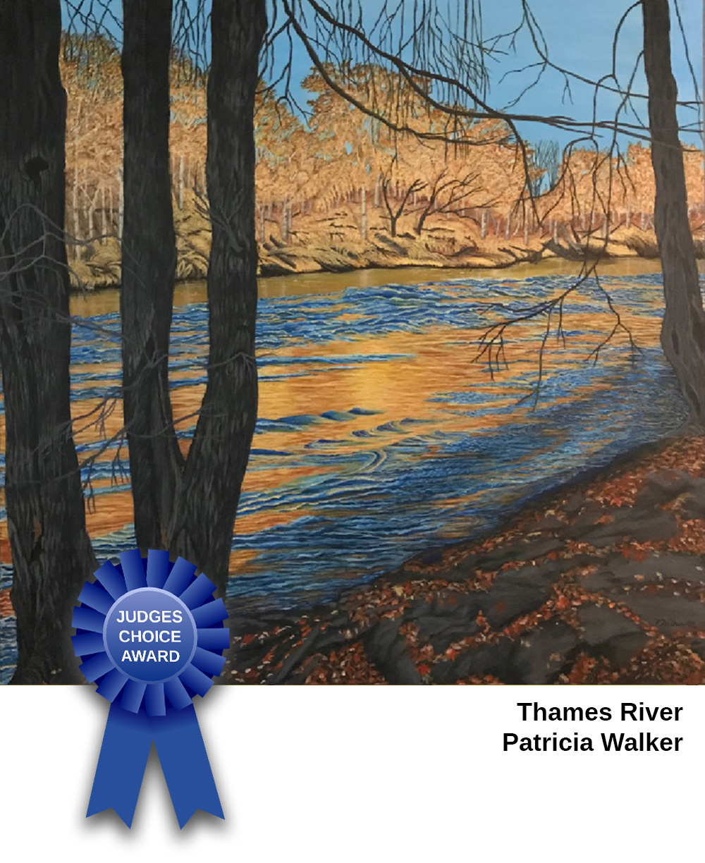
“Thames River” – Patricia Walker
Judges Comments:
A very effective use of complementary colours – the blues of the sky and water and the oranges of the trees and water reflection. The viewer comes through the forest trees to this dazzling view of moving water – very well depicted here with the plays of colours and reflected light. The softer toned-‐down far shore keeps it in the distance and does not compete with the water. Love that the foreground trees and rocky area, which are dark, contrast so well with the brilliance of the water. The minimum palette works effectively to unify all these very different areas and textures and the values define the depth levels. Skilled use of medium.

“Stillnesss” – Karen Cullaton
Judges Comments:
Creative interpretation of the foreground rocks in joyful and vibrant colours. Composition is arresting and effective. The curtain of three tree trunks to our left opens up to a view with distance, water, shoreline suggested in a subtle way. The rocks are the true stars of this painting. Love the area at the right foreground. Effective use of this brilliant medium to create a strong focus.

“Zorra Township Barn” – Bill Stephens
Judges Comments:
Usually a barn view is included in a pastoral setting that is more a landscape than an architectural study. This work brings our viewpoint right up to the ‘fence’ and the barn looms with very little background landscape showing and commands our respectful consideration. What really works here is the soft palette of pale monochromatic colours that don’t assault our eyes competing for attention. We are able take the time to view all the details of the barn, appreciate the rustic charm (snow on the roof, broken boards, rusty farm machinery) and can appreciate the foreground of snow, which helps define this as a winter scene. I love this composition.

“Abstract 20-2” – Darrell Hache
This work really demands a close examination. It looks like a segmented insect, a plant (such as corn), a tangle of talons, beaks, bones, twigs and unidentifiable forms that work together in providing a very interesting visual. I am reminded of the works of the Cubists and the Futurists in the early 1900’s. Subtle and deliberate shading suggest 3D forms, rather than flat shapes, and the lights and darks allow these forms to come forward and recede. The repetition of these forms, plus the monochromatic colour palette, unify the work effectively and keep the eye moving everywhere. A uniquely creative composition with lots of dynamic movement, evident as well in the brushstrokes.
Our September Art Show Judges Choice Winners

Deep Woods – Aura Burditt
Judges Comments:
This work is rich with deep and lush greens. The immediate effect is a sense of peace and connection with nature as we are situated immediately in the scene and moving forward. I am drawn to this strong composition with foreground tree trunks providing a definite vertical statement. Their intricate root patterns and contrasting rocks firmly focus the eye of the viewer. Then the path leads the eye with pleasure into the painting where depth is expressed with skill – the atmospheric perspective, the sky with low clouds, and the hazy horizon line are especially well done. Love the birds visible over the tree line to our right – they suggest we are heading to a fabulous view ahead. A forest-scape well done.
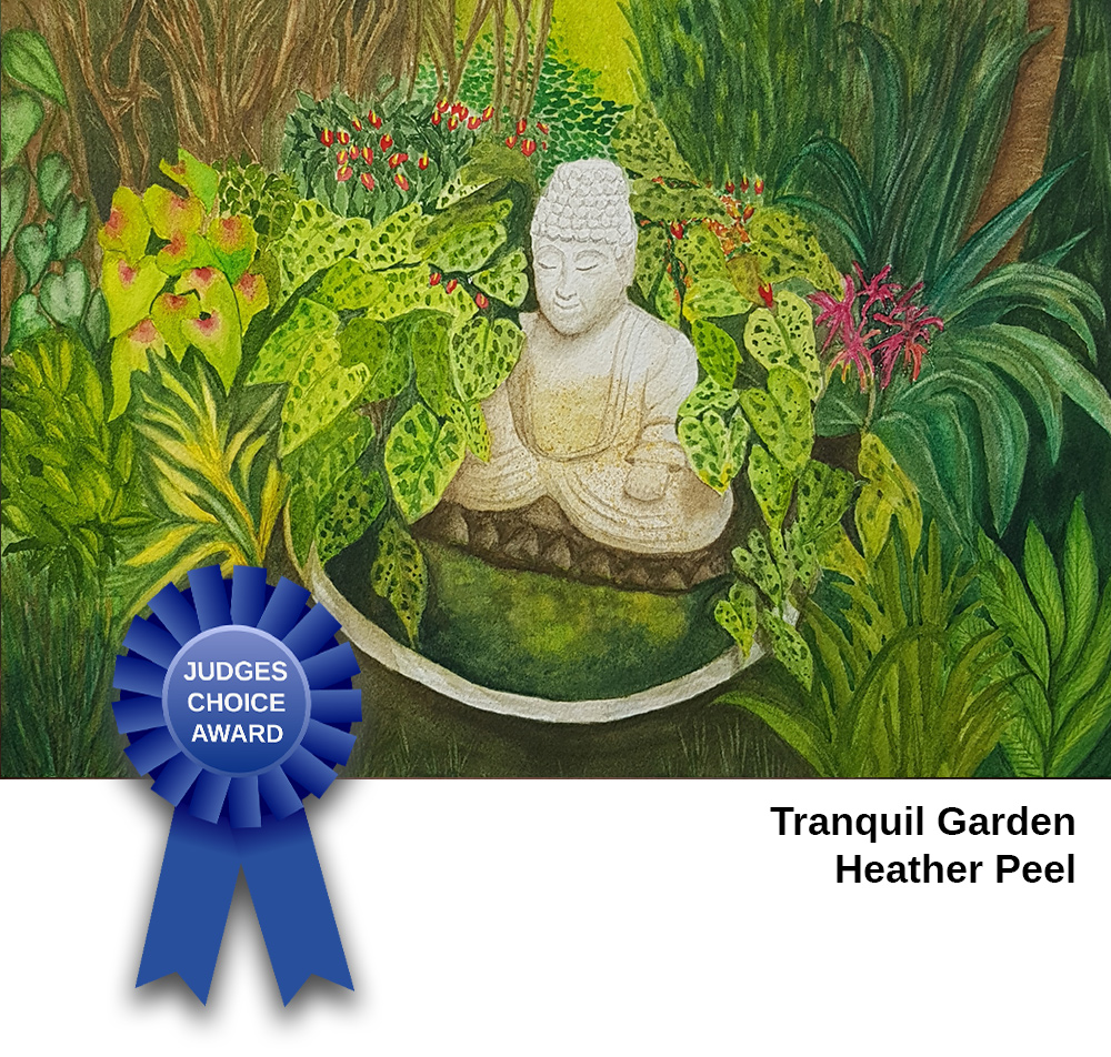
Tranquil Garden – Heather Peel
Love the treatment of this subject matter. The little garden Buddha is exquisitely and happily in the centre with his light colour contrasted by a variety of surrounding leaves and plants of many different varieties and shades of green. A shallow field of depth, decorative textures, intricate repetition of shapes, and linear qualities bring everything close to us for our appreciation. I am reminded of the work of Henri Rousseau. Dreamlike, stylized, and symbolic.

Pipe Dream – Xavier Wehlri
This work is impressive for the concept of space and depth achieved by the construction of some rather complicated and intricate pieces of pipes and devices whose purpose is not clear. It s like we are seeing the image bulge out at us like a fish-eye viewpoint. The surreal (dreamlike – great title!) nature of this work is pleasing and the eye is directed to follow the pipes and wires with no real centre of interest because of the repetition of similar connected forms. In fact, the negative space seems just as carefully crafted as the positive. As a digital work, it speaks not only to the skill with this medium but far more to the idea in the mind of the artist. Love the soft colours, another contrast to the very industrial forms of the pipes and in keeping with the idea of dream in which one can become lost. I am reminded of Escher. Nice!

A Glimpse – Charlene Tulloch
My regret is this work cannot be viewed physically as I am sure the surface texture of mixed media, and the play of light reflecting off the various elements enhance the effect significantly. In terms of composition, there are areas that rest the eye, such is where the large figure is on the left, areas that are busy, and areas that indeed just offer a ‘glimpse’ or a suggestion of what the object may be. All of the elements are married by a rich warm colour tone of golds, blues, and maroons and this brings a sense of unity. The interest is mainly on the surface of this art but overlapped elements and paint texture allow us to see the depth and this makes for a rich visual experience. Love the creativity most evident in this!

Nine Cherries – Marlene Lipton
Lovely contrast of red, round, shiny cherries against delicate, flat, old-fashioned lace tablecloth and the anchoring sliver of table at the bottom. It is a delight that these items are painted with a high degree of realism. The strong centre of interest is definitely the 3-d cherries, and then, the eye appreciates the juxtaposed texture of the flat lace. The interesting viewpoint, looking right down from above, and the close focus allow us to appreciate the work as an interesting composition, almost abstract in its simplicity. Lovely!
